Composer Misha Dutka has written numerous operatic works in the past, and I have created logo images for his Little Red Lighthouse and the Great Gray Bridge,Liebovar and Brandon’s Song. He commissioned a new illustration for a work he’s developing now, based on the poems of Dorothy Parker, a writer of the Algonquin Round Table fame. While Ms. Parker had wit and humor in her reviews and stories, her life was not such a happy one. Her colleague Alexander Woollcott once stated of her, “That bird only sings when she’s unhappy.”
I’ll post more about the work when there are details for a premier performance, but here is the working image for “Unhappy Bird.”
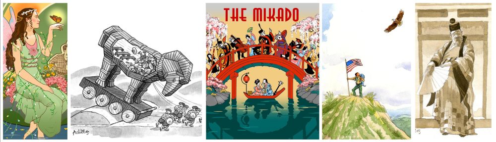
It’s the time of year when singers and musicians from all over Bucks County and the surrounding areas converge to rehearse and perform the unique musical confections that are Gilbert & Sullivan operettas. These musicals are unique in that their utter silliness combines so incomprehensibly well with some of the most lyrical arias and orchestra arrangements anywhere to be found. This season the Bucks County Gilbert & Sullivan Society has chosen to produce what is roundly considered to be their namesakes’ masterpiece, The Mikado. Set in an imaginary imperial Japan, it’s a whimsical, satirical, romantic and thoroughly British story – not to be taken for a tale of Japanese culture, because William Gilbert wrote it to perfectly skewer Victorian society, not the Japanese. And his plot is as improbable as it is enchanting.
I’m happy to have created the poster illustration for this beautiful show. I have always admired Japanese ukiyo-e woodblock prints, which have influenced Western art for centuries, and I based some of my palette and effects on that school of art, combined with colorful costumes that Bucks G&S already owns for the show.
Gilbert & Sullivan operettas are largely ensemble pieces; there are certainly main characters but part of the joy of the music comes from the chorus singing and reacting to the action in the plot. So I wanted to show many of the play’s characters in my Mikado art. I knew our stage set would include a small red arched bridge, so I researched ukiyo-e prints such as this one below of Shinkyo Bridge by Tsuchiya Koitsu, done in 1937. I thought a parade of people crossing such a bridge would be a fun way to show a lot of character types and costumes. I picked up some coloring and pattern from the traditional prints, also below, but still used my own cartoon style of drawing to project the comedy in the show.
My first pencil sketch was just shapes and gestures, but it roughed out the design. It occurred to me to put the young lovers in the story in a skiff under the bridge, even though this scene does not actually happen in the plot. But they do often hide their romance on the run, and depicting it this way makes a nice little wink against the chase scene of people on the bridge above.
I made rough sketches of many characters –
. . . and somewhere along the line I had the thought of putting our orchestra conductor in the chase scene too. Our orchestra is truly an fundamental part of the full G&S experience because the orchestrations accompanying the songs are incredibly beautiful. We attract about 40 excellent local instrumentalists for our shows, and they are so appreciated by our cast and audiences. So with our conductor in the chase scene I decided to put in a few instrumentalists as well! I think it accentuates the playfulness that’s a hallmark of G&S, and let’s everyone know our goal is to take nothing seriously in this play.
I tightened up the drawing of chosen characters, inked them by hand and scanned them to add digital color to the line drawing, like this
While I vaguely matched costume colors to existing costumes, I simplified my palette as did the ukiyo-e artists and applied colors flat, with no shading. I did the same with the background, working in pieces and then setting them up like my stage:
. . . and finally I put it all together into the finished poster.
Tickets have just gone on sale for Mikado and it should be a beautiful and funny production of this classic, which has been called “the most performed operetta in history.” See here for tickets and here for info on the show and Bucks Gilbert & Sullivan. I highly recommend this Mikado and our cast and orchestra of wonderfully talented characters!
A Mother of the Bride asked me to draw the lovely exterior of her daughter’s wedding venue for the Save-the-Date card. The venue will be The VanLandingham Estate in Charlotte, NC, and it’s a stunning building. The client showed me several other samples of cards with venues drawn in simple line and I loved the classic, elegant look of them.
She sent me a perfect head-on photo of the building and I drew it first in pencil.
A graceful and dignified mansion, is it not? After the ok from the client I inked it in cleanly with black ink and sent it off.
Just a few days ago the Mother of the Bride sent me the finished card, beautifully printed on heavy rag paper. The letterpress printing was done by Scott McClelland, with assistance from Bo, at Paper Meets Press in Glenside, PA. Letterpress is a traditional printing technique that creates a relief of the type and image in the paper – you can feel the depression if you run your fingers across the text. Some of the impression is visible in the closeup below.
I think the finished card is a very stylish and appropriate look for what I’m sure will be an elegant wedding.
In the last few months I’ve designed some logos for various events.
For TAFE (Theater Arts for Everyone) in York, PA, I created this logo for their stage show An Enchanted Bookshop Christmas, which involves characters from a number of children’s stories. First I started with a quick sketch with Tom Sawyer, Scrooge and Dorothy with Toto, and the fairy that brings them to life.
The director thought it might be better to show the bookshop itself, so I drew this graphic image.
The director suggested changing the boy in the doorway to the quirky bookshop owner, and making the fairy chubby, so with those refinements we finalized the logo to this:
I created a logo for the newly formed BuxMont Networking Group. I presented three ideas, below – can you guess which one they chose?
And finally I drew another graphic logo for TAFE, for their upcoming show Mystery at Senior Manor. This one involves some old folks who knit and play checkers at their retirement community, and what happens when one of them goes missing.
You can let me know in the comments which of the BNG logos you think is best, and I’ll answer it after a few guesses.
The Youth Orchestra of Bucks County gives children in grades 4 to 12 the chance to meet other young musicians, participate in group activities, and get a taste of what it’s like to be in a real orchestra. I was happy to be asked to create some logos for their fundraising galas in the last few years.
The first gala, which was held virtually in the spring of 2021, had a Night at the Movies theme, and their coordinator suggested images of popcorn, theater curtains or movie reels. I came up with some ideas for them to consider –
They liked the popcorn theme, and with suggestions from their coordinator I developed a marquee-type logo for the final –
This year’s gala will be in person and has the theme Tropical Rhythm, so the coordinator suggested images of bright flowers, greenery and some type of rhythm instrument. I drew a basic idea and tried various fonts & details –
The coordinator suggested a great ‘tropical’ typeface and a revised logo for YOBC, and I modified the design to his suggestions, for the final logo.
He did like the toucan I put in the first design, so he may use that in the program book where some art is needed.
Once I had drawn all the pages of Laurie Nowlan’s Robbie to the Rescue! as pencil sketches, I scanned all the drawings and colored them in roughly so both the author and I could see the placement of color throughout the book.
Early on when Laurie and I discussed her main characters, we had decided there should be some little bits of clothing to humanize Robbie and his older brother Ben. Laurie liked having Ben wear a baseball cap, and perhaps big sneakers for Robbie, to make him look smaller and younger and maybe a little clumsier than his older brother. In initial sketches I had given them orange and red jackets, thinking they’d stand out in green foliage – then when I started doing pages I realized it was autumn in the story and the leaves would be those colors. So I switched their jackets to blue and green.
The story has a number of scenes that take place during a rainstorm so I tried to vary the spreads between pages that bled off the sides and vignettes where there was white space around the illustrations, as well as full double page spreads where it was warranted, to keep the scenes from looking too similar.
Laurie suggested that the storm scenes should stay very blue and gray, so that at the end of the story when there are beach scenes, the change to sunny warmth would really be apparent to the reader. I agree it worked really well.
After this stage I started painting finished art for the book. I’ll write more about that, and about developing the cover art, in Part 3.
________________________
“Robbie to the Rescue!” is available now through BookBaby HERE.
Every year I design the poster for the Bucks County Gilbert & Sullivan Society’s musical comedy, and last year because of lockdowns we had to postpone the event. I’m happy to say the group is back in business this season and they will produce what would have been last year’s show, since the whole cast wanted to reassemble and perform it – and the show is Gilbert & Sullivan’s The Sorcerer. It will be performed LIVE, with a full live orchestra, on July 16, 17 and 18 in Doylestown. I love the wacky plot of this show, which involves a sorcerer in Victorian England who is asked to create a love potion of which an entire town unwittingly partakes, with chaotic and comic results. It strikes me as typical Gilbert & Sullivan silliness that instead of a cauldron like witches traditionally use to brew potions, this very proper Society Sorcerer’s potion is steeped along with a pot of tea.
I was lucky to be at an early costume fitting for the actor playing the title role, so I took photos of him in costume for reference when drawing, and the prop staff even had the large teapot that will be in the show on hand. I knew the kind of pose I wanted for the figure and started with pencil sketches –
I put some rough color on the sketched figure and placed him on the poster page, with the text that will go around him, and drew in the background roughly with a digital gradation, markers & colored pencils, to get a rough design of the page.
I refined my line drawing of the figure and did more detail on the digital color –
I worked on the title logotype next, to shape it around the sorcerer’s arm & umbrella. I used a fun typeface called “Island of Misfit Toys, ” although I played with the letter shapes a bit, stretching and adding some curls, to give it a consistent feel of whimsy.
I drew the cloud emanating from the teapot digitally and put the figure in place –
and then dropped in the title logotype and added some more magical swashes and particles circling the Sorcerer and the cloud, for the finished art.
The singers and musicians of Bucks Gilbert & Sullivan are busy rehearsing now and are thrilled to be back onstage live, with the full Bucks County Gilbert & Sullivan Orchestra accompanying them. I recommend everyone comes to The Sorcerer, performed at Delaware Valley University in Doylestown, PA, to enjoy this fun show! Tickets are on sale now through Eventbrite HERE. And to enhance the audience’s enjoyment of the show, the group provides interesting background info on the show on the website HERE.
Along with other designers I was interviewed for a blog on typography, and some of my remarks are cited in the article. I find the whole piece very interesting since it explores the way different designers look at type for commercial purposes. It’s a good read, I recommend it and the blog alphablogger for typography fans. The post is HERE.
I recently worked with Chef Kelly Unger, Chair of the Doylestown Farmers Market, to design a new logo for this very popular weekly gathering of Bucks County area farmers and shoppers, which has been going on for 45 seasons.
Kelly mentioned it would be nice to have some element in the design that would tie it to our location here in Doylestown, and that there are often buckets of bright flowers at the entrance to the market, a parking lot in the middle of Doylestown; so it would be nice to include flowers along with fruits and vegetables. I suggested making the logo reminiscent of a Mercer tile, since Henry Mercer is historically speaking the town’s favorite son. I did some rough logo ideas to show her and others on the market board.
(The designs below are (c) Pat Achilles. Are you interested in purchasing any of them? Contact me at achillesportfolio@gmail.com and we can discuss.)
(The designs shown in this post are (c) Pat Achilles. Are you interested in purchasing any of them? Contact me at achillesportfolio@gmail.com and we can discuss.)
The tile theme was popular, and so we tried adding more elements logo –
but it was determined that it got too busy. The image of the bike stuck though, for its symbolism of sustainability and since many shoppers do bike to the market, so we simplified the design but kept the outer tile-like border. I drew this rough pencil sketch, trying to show just enough of the bike to make it recognizable, but trying to keep the basket full of food the center of interest.
I drew the items in color in a graphic style and deliberately made the handlebar and flowers break through the border a bit, to give it a more contemporary design. I was asked to change the typeface at the request of the board, who wanted to keep a similar look with the brand of the established Bucks County Foodshed Alliance, of which this farmers market is a part. The finished logo is below.
I’m looking forward to the Doylestown Farmers Market’s 46th season opening on Saturday April 17. They will have over 30 local vendors selling beautiful cut flowers, fresh produce and delicious baked goods from 8 a.m. to 1 p.m. and you can meet some of the vendors as they are featured on the market’s Instagram at doylestownfarmersmarket.